


 JP1000 & Friends #2
August 24, 2009
- Project Date:March 3, 2007
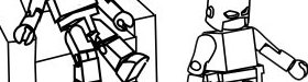

For this one I needed some feedback on the scene layout so I mocked up a basic outline and sent it to Fujis. I didn't have a good feel for how it should look and I didn't want to get too far into the process before realizing it wasn't working. Here's that 'sketch'.
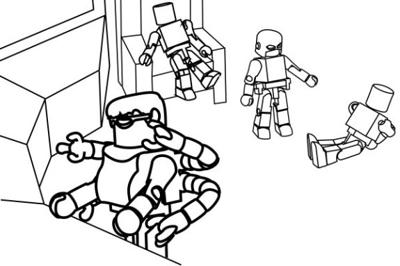
I got some good ideas back and tweaked the perspective a bit. Moved some elements around, added some color, and bingo-bango this comes out the other side.
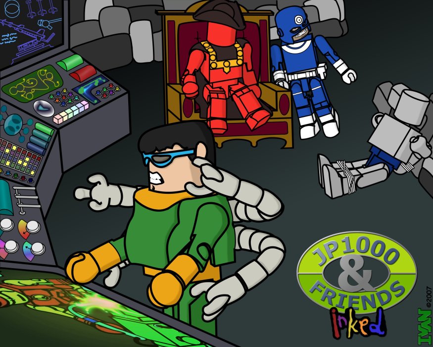
(Click for a larger version)
The major difference between this episode and the last is the addition of shading. Before working on these I never really paid attention to graphic styles or techniques. Of course I looked at other peoples work online and off, but I never took the time to figure out why a particular image looked good.
Shading is obviously an important step. My attempt here is pretty rudimentary, but you can see how much of a difference it makes when you compare to the non-shaded image below.
Looking back, I wish I would have put more effort into the rock walls. They were a late addition because I couldn't figure out what the captive should be leaning against. They don't seem to fit in with the scene. The perspective is off. They need to be shaded, etc. etc. They just come off as very half-assed. Oh well.
